Atelier. Building brands for a more conscious tomorrow.
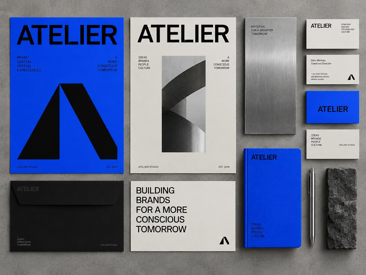
A brand identity exploration for a fictional design studio. A bold geometric monogram, an electric blue palette, and a disciplined typographic system carried across print and digital touchpoints.
 Concept
The question we explored.
Atelier imagines a studio working across brand, digital, and spatial experiences. The identity needed to feel architectural and confident while staying flexible enough for posters, stationery, and screens.
A monogram with structure
The "A" mark is built from two simple planes, echoing architecture and folded material.
A color you remember
Electric blue paired with stone, black, and brushed metal gives the brand a distinctive, tactile presence.
Typography does the talking
A tight grotesk set in uppercase blocks creates a recognizable rhythm across every format.
A system, not a logo
Grids, spacing, and layout rules make the identity easy to extend to new applications consistently.
Key features.
Atelier is a self-initiated identity concept, not a commissioned brand. It demonstrates how we build identities as systems that scale from a business card to a digital product.
Start a similar project- Monogram and wordmark
- Color and material palette
- Typographic system
- Poster and editorial layouts
- Stationery and business cards
- Brand guidelines outline
The disciplines involved.
Brand identity
A distinctive identity and visual language that works across every touchpoint.
ExploreUI/UX design
Research, flows, prototypes, and interfaces that make complex products feel clear.
ExploreWeb development
Brand websites and web applications, designed and engineered together.
Explore