Stride. A little movement. A bigger difference.
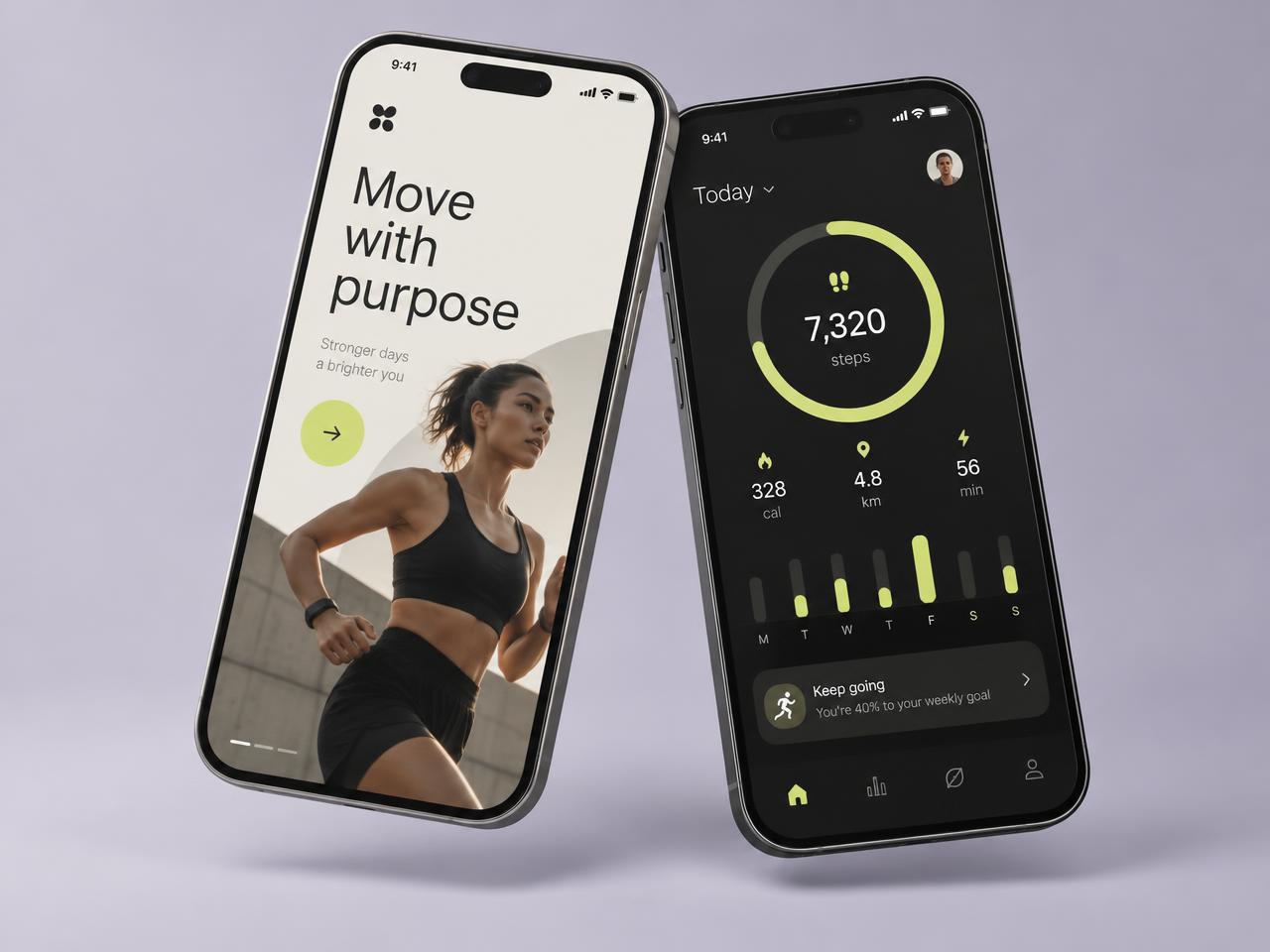
A mobile fitness concept centered on everyday progress. An expressive visual identity, clear activity insights, and welcoming onboarding make movement feel approachable.
 Concept
The question we explored.
Many fitness apps are built for people who already train. Stride explores the opposite starting point: someone who wants to move a little more each day and needs encouragement, not a wall of metrics.
Onboarding that welcomes
A warm, editorial first screen sets the tone - "Move with purpose" - before asking for anything.
One ring, one goal
The home screen centers on a single daily step ring, with calories, distance, and active minutes as secondary context.
Progress over perfection
The weekly chart and gentle nudges celebrate consistency, reframing a missed day as part of the week rather than a failure.
An identity with energy
Soft lime on charcoal gives the product a confident, optimistic personality that works in both light and dark contexts.
Key features.
Stride is a concept exploration rather than a released app. It reflects how we design for mobile: short sessions, one clear action per screen, and a personality people want to return to.
Start a similar project- Welcoming onboarding flow
- Daily activity ring
- Weekly progress chart
- Contextual encouragement cards
- Light and dark presentation
- Thumb-friendly tab navigation
The disciplines involved.
Mobile apps
iOS, Android, and cross-platform apps designed around real mobile use.
ExploreUI/UX design
Research, flows, prototypes, and interfaces that make complex products feel clear.
ExploreBrand identity
A distinctive identity and visual language that works across every touchpoint.
Explore